Interior Design 101: Colour
Before you read this article, take a look at the colour of the walls in your office. Chances are they’re either white, or grey. Or perhaps you’ve worked in a place where the office was painted one of those colours. Either way, it felt uninspired and lifeless. Choosing to paint your entire office white or grey is a step up from leaving the walls as bare concrete, but it’s not a particularly large step up.
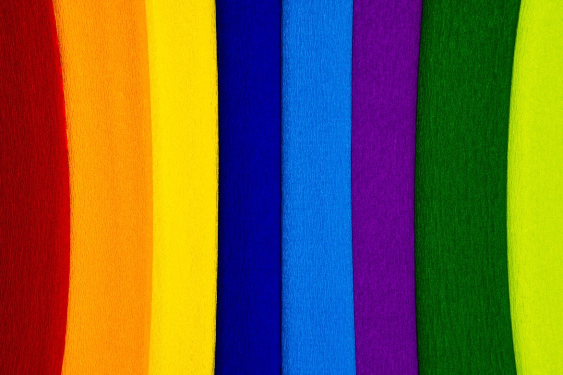
Adding colour to the workplace has been proven to increase productivity and make the space more visually engaging. A new office or a renovation is the perfect time to add some colour and make your work space more vibrant. Here are some colours you can use, their meanings and where it’s best to use them.
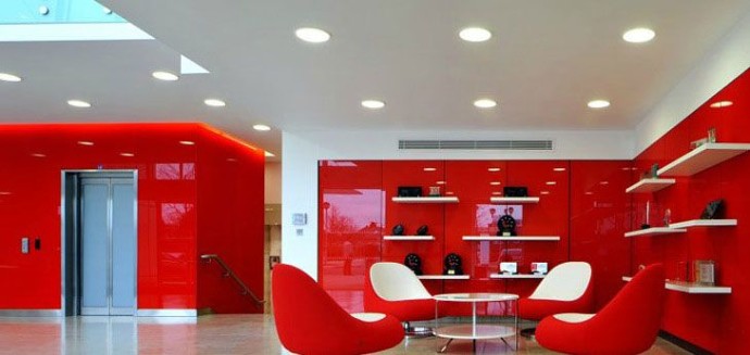
Red
Emotion: Passion
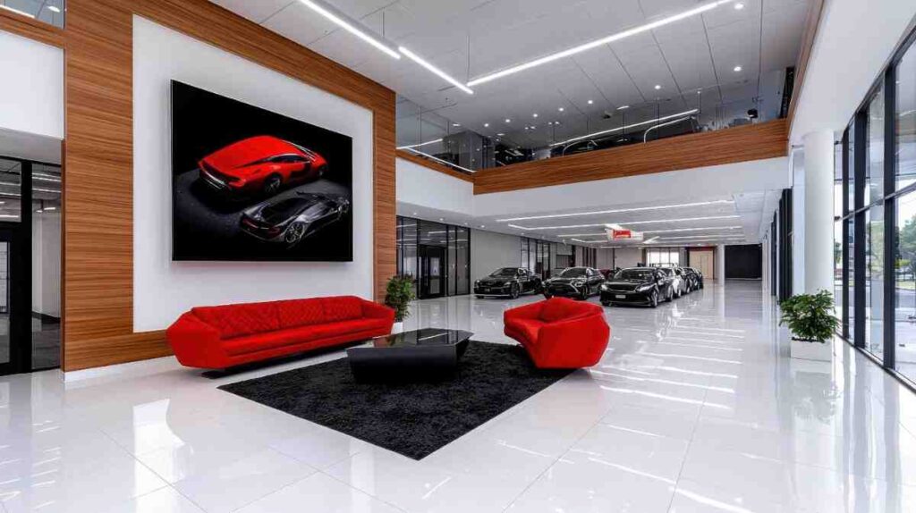
Where to Use It: A bold tone, Red is the colour of passion. It brings with it excitement and energy and as such is perfect for high impact roles such as sales. Red is also a colour that grabs attention and is perfect to highlight the best parts of your office. As with all colour choices, there needs to be a balance between enhancing a space and overwhelming it, so think carefully how and where you use red in your design.
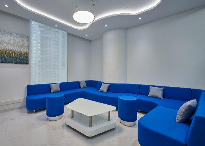
Blue
Emotion: Calm, Relaxation & Focus
Where to Use It: An extremely calming colour, blue is best used in places where employees will be working for long stretches of time and need to focus, such as accounting and finance departments.
Yellow
Emotion: Energy, Optimism & Creativity
Where to Use it: A bright, warm tone, yellow is ideal for places where you need your employees to be at the best for creative work. Designers, artists and marketing personnel can all benefit from a splash of yellow in their workspace! Be careful though, too much yellow can have the opposite effect and cause anxiety, so it’s best to keep it low key.
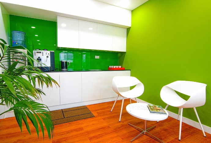
Green
Emotion: Nature, Relaxation
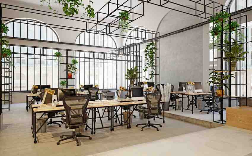
Where to Use it: A great colour for those who want to add a touch of the natural world to their workplace. Green is a calming and relaxing colour, like blue. It can be used for places where people will be working for long periods of time, such as accounting, finance, client servicing roles or IT. Green can also be used for break rooms, to give your employees a visual break as they relax and recharge throughout the day.
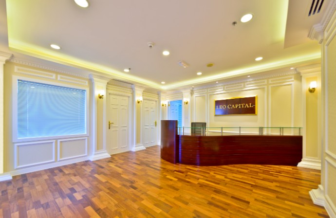
White
Emotion: Serenity, purity
Where to Use it: Though plain and unadorned, white does have its uses. As a neutral colour, it’s perfect for places where focus is paramount and where work needs to be done without any distractions, such as meeting and conference rooms.
Designing a new office or renovating an old one? Stuck on what colours you want to make it feel like a brand new company? Our talented team of interior designers at Horton Interiors can help! Call us on +971 4 388 1 163 or send us an email at info@hortoninteriors.com and we’ll be in touch.